Latest Entries »

Having familiarized with the properties of the Fourier transform, we now move on to 2 dimensions. The activity required to generate the Fourier transform of a collection of patterns.

Figure 1. A square apperture and its transform

Well this is the expected FT transform of a square aperture.  Out of curiosity another square aperture  with smaller dimension was FT-ed. The resulting image is shown in figure2. Figure 2. A smaller square aperture and its transform

The corresponding transform of the smaller square produced almost the same figure as the first square. But with one remarkable difference. The fringe spacing of the new transform is larger than that of the big square.

Figure 3. An annulus and its transform

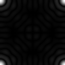
The second aperture is annulus. For this part, the difference on the aperture dimension is also investigated. With a big annulus a boring pattern was produced. However, with a small annulus, as seen in the figure, a dramatic pattern is generated.It could be noticed that some orders are missing. This is due to central circle blocking them.

The third aperture is a square annulus. Basically it has the same features of the annulus “donut” presented above but with a different shape, a square instead of the circle. Figure 4. A square annulus and it transform

This time the generated transform is similar to that of the square aperture. However, some fringes or patches (since I like the sound of that word for the moment) vanished. This might be due, again, to the central square. The next aperture is composed of two vertical lines symmetric about the x-axis. The lines will act like slits, like Young’s double slit experiment.

Figure 5. 2 vertical slits along the x-axis.

The resulting transform resulted to a horizontal line. This line is composed of dark and bright vertical lines that is due to the interference pattern of each slit. A dark line corresponds to the destructive interference between the slits. The last aperture are 2 dots on the x- axis.

Figure 6.  2 “dots” on the x-axis

The resulting transform are vertical

Figure 7.  2 “dots” on the x-axis

However, since our dots are more like circles, the resulting transform looked liked airy disks with alternating dark and bright vertical lines.

The Anamorphic property of FT is investigated in the following part. Sinusoids of different frequencies were generated. and the behavior of their FT were noticed.


Figure 8.  A sinusoid of  f = 1 and its transform


Figure 9.  A sinusoid of  f = 2 and its transform

Figure 10.  A sinusoid of  f = 4and its transform

Figure 11.  A sinusoid of  f = 32 and its transform

The four figures above show the generated sinusoids and their FT’s. As we increase the frequency, we see the expected behavior of more cycles. Also, back then, we know that the FT of a sinusoid are Dirac deltas. This is represented by the spots centered on the origin along the y- axis.  A major trend seen the images is that,  as the frequency is increased, the dirac delta move farther away from the origin.

Figure 12.  A sinusoid of  f = 4 and a constant bias of 2

This time a sinusoid with frequency 4 and a constant bias of 2 was projected into Fourier space. A look at the transform image shows almost exactly the same figure as Figure 9. However a distinct difference is the presence of a single bright spot on the origin. This is the contribution of our bias. Why located at the origin?  Thinking back a little, a Fourier transformation reveals the frequency signature of a function. However the frequency of a constant bias is always 0. From this, we can see one utility of FT.

Figure 13.  A sinusoid of  f = 4 and a non-constant bias

Figure 13  is somewhat a variation of Figure 12. Here we are presented with another bias. This time in a form of a function (sinusoid with f = 4).

The initial pattern looks like a bit complicated BUT…. if we threw the function to Fourier space, we see, tada… Only 2 frequencies in the complicated function. So for this the utility of FT is furthermore emphasized.  Fourier Transformations  literally simplifies functions by going to fourier space. The signature frequencies of the function can then be identified.

Figure 14.  A sinusoid of  f = 4 and 0 rotation angle

Figure 15.  A sinusoid of  f = 4 and 30 rotation angle

Figure 16.  A sinusoid of  f = 4 and 60 rotation angle

From the behavior of the FT peaks, it can deduced that their rotation is in the opposite direction of their sinusoid’s rotation. For the last part, corrugated roofs were to be simulated. This can be done my multiplying a sinusoid on the x and y axis.

Figure 17.  A product of an x-sinusoid with f = 3 and a y-sinusoid with f = 2.

I used the specified frequencies above and got that interesting pattern. Looking at the FT we can see that the dirac delta for the x and y sinusoids are perpendicular to each other owing to the fact that they belong to different axis that are perpendicular to another. Also interesting to note is that the FT of the whole product is just the combination of the FT of the individual sinusoids. It should be reviewed that a product in dimensional space leads to a superposition in frequency space.

Figure 18.  A complicated sinusoid

In this figure, a combined sinusoid was added to a rotated sinusoid.  The square peaks correspond to the transform of the combined sinusoids while the one in the middle is attributed to the sinusoid rotated at 30. The last figure used a combined a sinusoid and 3 rotated sinusoids. This sinusoid have different frequencies and different rotation angles. We should expect that these peaks should be very much scattered around the small frequencies of the combined sinusoid.

Figure 19.  A combined sinusoid and 3 rotated sinusoids.

Also if we intend to make to interpolate from this, we should expect a ring if we have the same frequencies but different rotated angles. This is strenghtend by this image

Figure 20.  A combined sinusoid and rotated sinusoids.

One can clearly see that if all the angles is represented he will end up with an arch.

For this activity, I grade myself 10. This activity wouldn’t have been completed without the help of Mr. Diaz

Activity 6

The first part of the activity asks us to do get the Fourier transform on an aperture.

Figure1. On the left is the initial aperture, the fft2 transform of the aperture and on the right is the shifted fourier transform of the aperture

The first picture shows the initial aperture before the required transformation. The one on the middle on the other hand is the resulting image after the fft2 transformation of the aperture. It is interesting to see that indeed the fft2 transformation is inverted along its diagonal, just like what the AP186 manual said. The last picture shows the shifted transformation of the aperture. This, I think, is the required image, which is the real Fourier transform on the aperture.

Figure2. Different apertures with their respective transforms on their side.

I also explored apertures with different sizes. Figure2 is a graphic (obviously) portrayal of my findings. As the aperture gets bigger, its transform seems to approach a dot. On the other hand, the transforms gets much more evident, and yes, eye-catching, if the aperture gets smaller. Also the transformation was done twice on the aperture, that is, after getting the Fourier transform of the aperture another Fourier transform was applied to the acquired transform. We found that applying the transform twice we got the same aperture back. Implying that we did nothing, or did we?

Figure2. On the left an “A” aperture, its shifted fourier transform and the transform done twice on the aperture.

This time a big letter A was the object of our Fourier transform, this time the effect of applying the fft twice is very obvious. The image became inverted and the perfectly white area of A became blurred.

The second part of the activity involves convolution. Convolution is the smearing of one function to another. The resulting function is somewhat a combination of both. Say these two functions are f and g, their convolution will be given by Also this is also equivalent to

where H,F and G are the Fourier transform of h,f and g. Convolution is very useful since the concept is very much used in modeling optical systems. One such system is the lens system. Say f represents the object and g represents the transfer funcction of our lens. The convolution of f on g represents  the image produced by the lens.

Figure3. The VIP object

For this part, the convolution of the word VIP with two appertures was investigated. The resulting image is

Figure4. The apertures and the resulting convolution

As obviously seen the smaller aperture produced a very blurry image, even to the point of producing ripple-like patterns around the object. Meanwhile the larger aperture produced a better image. However, even with a larger aperture, the image produced did not really duplicate the original image. The VIP image produced has shadows or more like “penumbras” on the supposedly white areas of the original image. Also most obvious is the inversion of our image which is an expected behavior of our transform

The  third part involves correlation. Correlation basically involves the degree of similarity between two functions f and g. Mathematically,

The correlation can also be given by where P, F and G stands for the fourier transform of  p, f, and g. The asterisk stands for complex conjugation of F and G.

In this activity a sentence was correlated to a letter as shown by the images below

Figure5. The sentence and the letter that are to be correlated

From the definition of correlation, we expect to see something on the letters of A on the sentence. So  without much further ado, the image will now be revealed..

.

.

.

.

Figure 6. The resulting correlation

The resulting image clearly shows the resulting correlation. So that something that we wanted to see are bright spots on the letter A. So we see that our correlation really worked, we  sort of localized the A’s in our sentence as evidenced by the bright spots.

The last part is related to edged detection. Basically, I think this is just an extension of our correlation earlier. All we need is a mathematical representation of the edge we want to detect or  emphasize. This can be done using the imcorrcoef() function in scilab.  First, as stated above, we need the edges. Some representations are  the following matrices.

Figure 7. The matrices representations of  a horizontal, vertical, and spot edges

So let us look at the resulting images from the correlations

Figure 8. The matrices representations of  a horizontal, vertical, and spot edges

The image a) used a horizontal template, curiously the horizontal edges were really emphasized and the vertical edges vanished. Image b on the other hand emphasized on the vertical lines so, now horizontal lines vanished. The third image used a spot template, so, this time, all lines were emphasized

Also on a side note, changing the magnitude of the matrix did not pose any noticeable change in the resulting image.

So for this activity, I will grade myself with 10.

I would like to thank Mr. Diaz, Mr. Abat for their insights and for helping me during those times I was lost

Scilab Basics

If I was allowed to choose what would be the title of this post, it would have been Scilab’s First Assault on me. Well, honestly I’m not really an efficient programmer. Good thing, Ma’am Jhing provided us a very complete trial code. Programming was not really an issue this time. We only needed to change the functions that we were supposed to graph. The only problem that I had could only be blamed to me. You see, I failed to immediately realize the mathematical representation of the figures that we were supposed to plot.
The Scilab version I used was 5.2.1 with SIVP . Scilab as we all know is a free software. This version of Scilab worked perfectly with SIVP Toolbox (which was required for plotting the figures for me because, I think, my OS is Ubuntu. Also, I revised a bit of my code. The code provided utilizes a matrix (of zeros) to, by various and ingenious ways of manipulation, creates different images. So by changing the functions somewhere in the code a different image is generated.
Attached here is the code that I used to generate the images:

// 1centered square
nx = 500; ny = 500;

//definesthenumberoflements along x and y
x = linspace(-5,5,nx); //defines the range
y = linspace(-5,5,ny);
[X,Y] = ndgrid(x,y); //creates two 2-D arrays of xand y coordinates
r= sqrt(X.^2 + Y.^2); //note element-per-elementsquaring of X and Y
A = zeros (nx,ny);
A (find(abs(X)<2 & abs(Y)<2) ) = 1;

imshow(A)

im=rand(1000,1000);

ret = imwrite(A, ‘centeredsquare.png’);

// 2sinusoid

nx = 750; ny = 750; pi = 3.141592653589793238462643383 //definesthenumberoflements along x and y and defines pi

x = linspace(-10,10,nx); //defines the range

y = linspace(-10,10,ny);

[X,Y] = ndgrid(x,y); //creates two 2-D arrays of xand y coordinates

Y = sin(X.*pi);

imshow(Y)

im=rand(1000,1000);

ret = imwrite(Y, ‘sinusoid.png’);

// 3 gratings

nx = 500; ny = 500; //definesthenumberoflements along x and y

x = linspace(-5,5,nx); //defines the range

y = linspace(-5,5,ny);

[X,Y] = ndgrid(x,y); //creates two 2-D arrays of xand y coordinates

A = zeros (nx,ny);

A(find(abs(X)>0.1)) = 1;
A(find(abs(X)>0.25 & abs(X)>0.35)) = 0;
A(find(abs(X)>0.35 & abs(X)>0.55)) = 1;
A(find(abs(X)>0.55 & abs(X)>0.75)) = 0;
A(find(abs(X)>0.75 & abs(X)>0.95)) = 1;
A(find(abs(X)>0.95 & abs(X)>1.15)) = 0;
A(find(abs(X)>1.15 & abs(X)>1.35)) = 1;
A(find(abs(X)>1.35 & abs(X)>1.55)) = 0;
A(find(abs(X)>1.55 & abs(X)>1.75)) = 1;
A(find(abs(X)>1.75 & abs(X)>1.95)) = 0;
A(find(abs(X)>1.95 & abs(X)>2.15)) = 1;
A(find(abs(X)>2.15 & abs(X)>2.35)) = 0;
A(find(abs(X)>2.35 & abs(X)>2.55)) = 1;
A(find(abs(X)>2.55 & abs(X)>2.75)) = 0;

imshow(A);
im=rand(1000,1000);
ret = imwrite(A, ‘grating.png’);

//4 annulus

nx = 500; ny = 500;

//definesthenumberoflements along x and y

x = linspace(-5,5,nx); //defines the range

y = linspace(-5,5,ny);

[X,Y] = ndgrid(x,y); //creates two 2-D arrays of xand y coordinates

r= sqrt(X.^2 + Y.^2); //note element-per-elementsquaring of X and Y

A = zeros (nx,ny);

A (find(r<2.7 &r>1.7) ) = 1;

imshow (A);

im=rand(1000,1000);

ret = imwrite(A, ‘annulus.png’);

//5 Transparent Aperture
nx = 500; ny = 500; pi = 3.141592653589793238462643383

//definesthenumberoflements along x and y
x = linspace(-5,5,nx); //defines the range
y = linspace(-5,5,ny);
[X,Y] = ndgrid(x,y); //creates two 2-D arrays of xand y coordinates
r= sqrt(X.^2 + Y.^2); //note element-per-elementsquaring of X and Y
A = zeros (nx,ny);
A (find(r<4.7) ) = 1;
b = A.*exp(-0.1*pi*r);
imshow (b)

im=rand(1000,1000);
ret = imwrite(b, ‘transparency.png’);

Oh, by the way, the images that we were required to reproduce are: a centered square aperture, a sinusoid along the x-axis, grating along the x-direction, an annulus, and an aperture with graded transparency.

Figure 1. The Centered-square Aperture (500×500)

Starting with the centered square, it was generated using the code snippet:

A (find(abs(X)<2 & abs(Y)<2) ) = 1;

Since we already have am matrix of zeros , the above code modifies the elements of the matrix that have  the absolute value of X and Y coordinates less than 2, to 1. The elements then display the value of 1 which corresponds to a “white” aperture on the center of the plot.

Figure2. Sinusoid along the x direction (750×750)

The 2nd image  requires a sinusoid along the x-direction. At first I found my intial results to be weird because I did not know that Scilab had inverted their orientation of their x and y-axes. The code for the sinusoid should have been a very easy one-liner:

Y = sin(X.*pi)

Unfortunately, because of the inversion of Scilab I took more time than neceesary. Also despite its apparent simplicity it took quite a while for me to figure out its mathematical representation.

Figure3. Grating along the x-direction(500×500)

The third part of the activity was a grating along the x axis. For now I used this inefficient bit of code to generate the grating.

A(find(abs(X)>0.1)) = 1;
A(find(abs(X)>0.25 & abs(X)>0.35)) = 0;
A(find(abs(X)>0.35 & abs(X)>0.55)) = 1;
A(find(abs(X)>0.55 & abs(X)>0.75)) = 0;
A(find(abs(X)>0.75 & abs(X)>0.95)) = 1;
A(find(abs(X)>0.95 & abs(X)>1.15)) = 0;
A(find(abs(X)>1.15 & abs(X)>1.35)) = 1;
A(find(abs(X)>1.35 & abs(X)>1.55)) = 0;
A(find(abs(X)>1.55 & abs(X)>1.75)) = 1;
A(find(abs(X)>1.75 & abs(X)>1.95)) = 0;
A(find(abs(X)>1.95 & abs(X)>2.15)) = 1;
A(find(abs(X)>2.15 & abs(X)>2.35)) = 0;
A(find(abs(X)>2.35 & abs(X)>2.55)) = 1;
A(find(abs(X)>2.55 & abs(X)>2.75)) = 0;

One who knows programming, even if  it’s just a bit (like me) could easily this code could still be improved. It basically modifies the matrix so that it would output alternating black and white strips. Since the reguired image is just a repeating alternate strips, one could say that it would be best to use a loop for this part. Unfortunately, at the moment, I’m not that well versed with Scilab loops, that’s why I have settled for this bit of bulky, inefficient code.

Figure4. The Annulus (500×500)

The 2nd to the last image is an annulus. This was the first image that apealed to me, since it’s very similar to the introductory code that was given to us. I also found it the easiest to genrate.

A (find(r<2.7 &r>1.7) ) = 1;

This code specifies the area in the matrix of zeroes (black) that will be white.  Basically it, just with the introductory code but then we defined another radius to mark the beginning of the inner circle.

Figure5. Aperture with gaussian transparency

The last image is also similar to the aperture of the introductory code , only it required to have a graded transparency or Gaussian transparency

b = A.*exp(-0.1*pi*r);

The code for the aperture was multiplied to an exponential decaying function. The constants in the exponent should be negative to achieve the gradually darkening behaviour of the aperture. Also after playing the constant, it is found that as the constant gets higher, that is more negative, the aperture greys rapidly.

I would like to thank Ma’am Jhing for providing the class the very useful aperture code, for showing to the class the required images, without which I would have a harder time knowing if my output is correct. To Mr. Dennis Diaz, for reminding the mathematical representation of a square, to Jonathan Abat for his comments on my Figure 5, and to Nemesio Mangila for his invaluable insights regarding the activity.

For my self-evaluation, I think I would like to grade myself with 8 since I think I was able to do the required output, but because I lacked the motivation, I think, to make the blog.

Normal 0 false false false EN-US X-NONE X-NONE MicrosoftInternetExplorer4

The last image is also similar to the aperture of the introductory code , only it required to have a graded transparency or gaussian transparency

b = A.*exp(-0.1*pi*r);

The code for the aperture was multiplied to an exponential decaying function. The constants in the exponent should be negative to achieve the gradually darkening behavior of the aperture. Also after playing the constant, it is found that as the constant gets higher, that is more negative, the aperture grays rapidly.

I would like to thank Ma’am Jhing for providing the class the very useful aperture code, for showing to the class the required images, without which I would have a harder time knowing if my output is correct. To Mr. Dennis Diaz, for reminding the mathematical representation of a square, to Jonathan Abat for his comments on my Figure 5, and to Nemesio Mangila for his invaluable regarding the activity.

Back in the olden days, when  MS Excel, OpenOffice SpreadSheet and other sophisticated graphing softwares were not yet around, scientist had no choice but to graph their data by hand. Well that was ages ago, this time, 21st century we have this amazing softwares, not to mention fast and very capable computers that does not only aid us in graphing our data but also almost makes themselves necessary in  communicating our data. This activity somewhat utilizes some of this technologies to do ,somewhat the reverse of what was done in the olden days, that is from a hand drawn graph, find the data used to make the graph.

Using a hand-drawn graph from  a journal I found in the CSLib, (forgive me for my lack of  professionalism, I failed to take note of name of the old journal), and the help of the softwares Paint and MS Excel I tried to extract the points used in the graph.

Figure1: The Decades-old Graph

Using Paint, I took notice of the pixel locations of the tick marks for both the tick marks along the x and the y- axis. Then because the tick marks indicate their obvious value and I knew their pixel location, I have a pretty good idea how to reconstruct the data. Paint indexed the location of tick mark 0.6 on (80,315) pixel location. 2.7 on the other hand  is found at (825,315). The scaling factor, for the x-axis, xsf, is given by  (2.7 – 0.6)units/ (825-80)pixels or  0.002818792 unit/pixel. Following the same logic for y-axis but utilizing its y-pixel,  the scaling factor ,ysf,  was found out to be at  -0.013061224 unit/pixel. The negative scaling factor for the y-axis, when one wastes their time to think on it, makes sense since origin of our pixel plane is on the  upper leftmost corner.

Now that we have the scaling factors, its time to use these to look for the physical values:

The physical values could be found by using this equations

x-value = (x-pixel location – 0.6)*xsf + 0.6                 (eq.1)

y-value= (y-pixel location – 0.6)*ysf + 1                      (eq.2)

The addition of 6 and 1 unit for both the equations stems from the fact that our initial tick  marks on the x-axis and y-axis had values 0.6  and 1 hence the “biasing”

After finding the equations, I placed my mouse on the points found on the graph, indexed each point, applied the equations and tried to make a trendline of one set of points

Figure2: The Reconstruction

I failed to superimpose the graphs successfully but if i try to judge the picture on the positioning of the points, I think that my reconstruction was quite accurate. (Maybe I’m just biased since it’s my work.) Minor (it’s minor to me) deviation I think could be attributed to the fact that the tick marks were not uniformly distributed resulting to some points deviating from their predicted positions.

Well, since this one hell of a late submission and I failed to superimpose the graphs, I think I will give myself a 5.

I would like to express my gratitude to Ma’am Jing for the useful manual, to the unnamed journal from which I have “borrowed” a graph on its pages, and to my many friends that keep encouraging me to do this post Thankyou all.

Hello world!

Welcome to WordPress.com. This is your first post. Edit or delete it and start blogging!