Back in the olden days, when MS Excel, OpenOffice SpreadSheet and other sophisticated graphing softwares were not yet around, scientist had no choice but to graph their data by hand. Well that was ages ago, this time, 21st century we have this amazing softwares, not to mention fast and very capable computers that does not only aid us in graphing our data but also almost makes themselves necessary in communicating our data. This activity somewhat utilizes some of this technologies to do ,somewhat the reverse of what was done in the olden days, that is from a hand drawn graph, find the data used to make the graph.
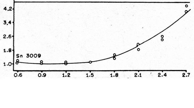
Using a hand-drawn graph from a journal I found in the CSLib, (forgive me for my lack of professionalism, I failed to take note of name of the old journal), and the help of the softwares Paint and MS Excel I tried to extract the points used in the graph.
 Figure1: The Decades-old Graph
Using Paint, I took notice of the pixel locations of the tick marks for both the tick marks along the x and the y- axis. Then because the tick marks indicate their obvious value and I knew their pixel location, I have a pretty good idea how to reconstruct the data. Paint indexed the location of tick mark 0.6 on (80,315) pixel location. 2.7 on the other hand is found at (825,315). The scaling factor, for the x-axis, xsf, is given by (2.7 – 0.6)units/ (825-80)pixels or 0.002818792 unit/pixel. Following the same logic for y-axis but utilizing its y-pixel, the scaling factor ,ysf, was found out to be at -0.013061224 unit/pixel. The negative scaling factor for the y-axis, when one wastes their time to think on it, makes sense since origin of our pixel plane is on the upper leftmost corner.
Now that we have the scaling factors, its time to use these to look for the physical values:
The physical values could be found by using this equations
x-value = (x-pixel location – 0.6)*xsf + 0.6 (eq.1)
y-value= (y-pixel location – 0.6)*ysf + 1 (eq.2)
The addition of 6 and 1 unit for both the equations stems from the fact that our initial tick marks on the x-axis and y-axis had values 0.6 and 1 hence the “biasing”
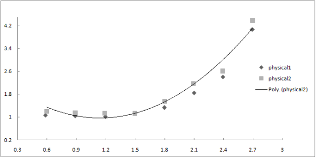
After finding the equations, I placed my mouse on the points found on the graph, indexed each point, applied the equations and tried to make a trendline of one set of points
Figure2: The Reconstruction
I failed to superimpose the graphs successfully but if i try to judge the picture on the positioning of the points, I think that my reconstruction was quite accurate. (Maybe I’m just biased since it’s my work.) Minor (it’s minor to me) deviation I think could be attributed to the fact that the tick marks were not uniformly distributed resulting to some points deviating from their predicted positions.
Well, since this one hell of a late submission and I failed to superimpose the graphs, I think I will give myself a 5.
I would like to express my gratitude to Ma’am Jing for the useful manual, to the unnamed journal from which I have “borrowed” a graph on its pages, and to my many friends that keep encouraging me to do this post Thankyou all.


